Maria
Loren

Creative Direction · Editorial Beauty · Brand Strategy

The Nothing Else has already done the hardest thing: said something true. "Nothing" is the whole story. My job is to make that word feel alive, warm, and utterly irresistible to the people who need it most.

Emotionally
intelligent creative

I’m a Creative Director and brand strategist leading visual identity, campaign, and editorial work across beauty, wellness, and consumer lifestyle — from boutique DTC brands to high-volume national portfolios reaching millions of customers each week.

I founded Maria Loren Designs to build brands that earn trust by refusing to perform it. My work moves people before it informs them — and it’s informed by a rare combination of intimate storytelling expertise and scale-level operational rigor.

Waterless skincare is one of the most meaningful category shifts in a generation. The Nothing Else deserves creative leadership that honors that — warm, precise, and botanically alive.

A vision rooted
in botanical truth

The Nothing Else has already said something bold. “Nothing” is the whole brand story. My creative direction would make that word feel lush, warm, and entirely impossible to ignore.

Waterless as Visual Language

0% water looks like clarity and botanical richness — the concentrated color of a rosehip, the warmth of beeswax at golden hour. I translate formula into feeling, and make absence feel like abundance.

Botanicals That Work Hard

Botanical imagery in beauty is often decorative. I use it structurally — ingredients as proof points, not props. Every visual decision connects back to what’s actually in the bottle.

Community as Creative Asset

The Nothing Else already has a community sharing real skin results. I’d elevate that voice — treating genuine customer testimony as editorial content, as beautifully as any campaign shoot.

Warm, Not Clinical

Preservative-free skincare can tip cold in the wrong hands. My direction brings warmth, color, and living texture — a brand that feels like a garden and performs like a lab. Never sterile. Never generic.

Where Nothing Else
goes next

Identity Expansion

Evolving the visual system so the waterless thesis lives in every touchpoint — packaging, digital, retail. Botanical warmth threaded through every element, not just the logo.

Campaign Architecture

A three-campaign framework: ingredient sourcing, daily ritual, and the Water(less) Pledge. Each with distinct visual grammar that shares the same botanical DNA.

Ingredient Storytelling

Rosehip, jojoba, beeswax — rendered with the gravity they deserve. Documentary portraiture, not wellness stock. Museum-quality still life meets skincare efficacy.

Sensitive Skin Community

Making real-skin UGC as visually compelling as a campaign shoot. The Nothing Else community is a creative asset — I’d give it the editorial treatment it deserves.

Water(less) Pledge

Turning the 1,000,000 gallon goal from a progress bar into a living campaign — something the community owns, celebrates, and shares. Environmental urgency made beautiful.

Retail & Experiential

From Wolf & Badger to future wholesale — physical spaces as sensory proof. Fragrance, texture, warmth. Making preservative-free feel like an indulgence worth seeking out.

Three ideas, ready to build

Strategic frameworks with distinct visual identities — each designed to work across digital, social, editorial, and experiential channels.

Macro botanical ingredient photography — rosehip and beeswax editorial still life
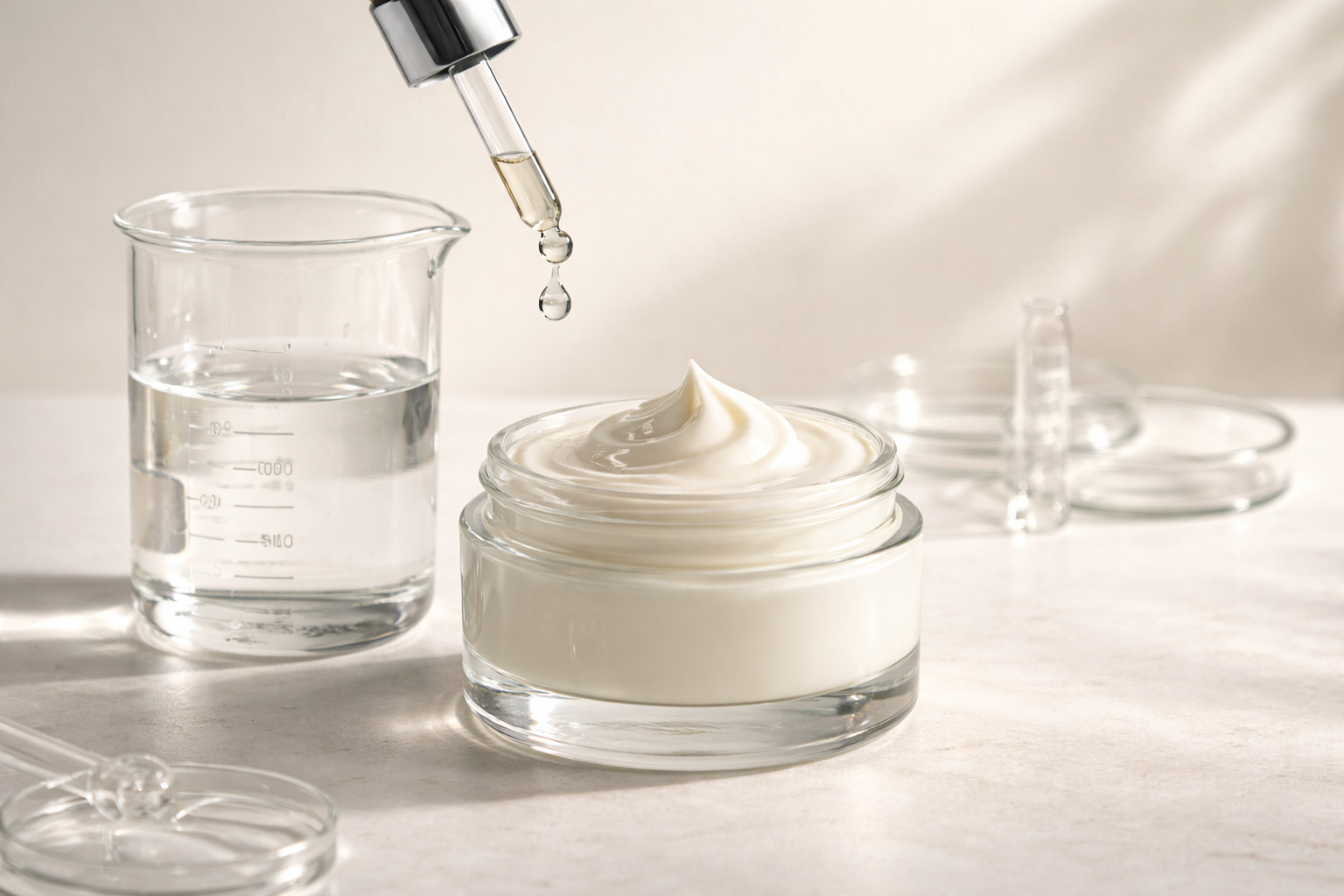
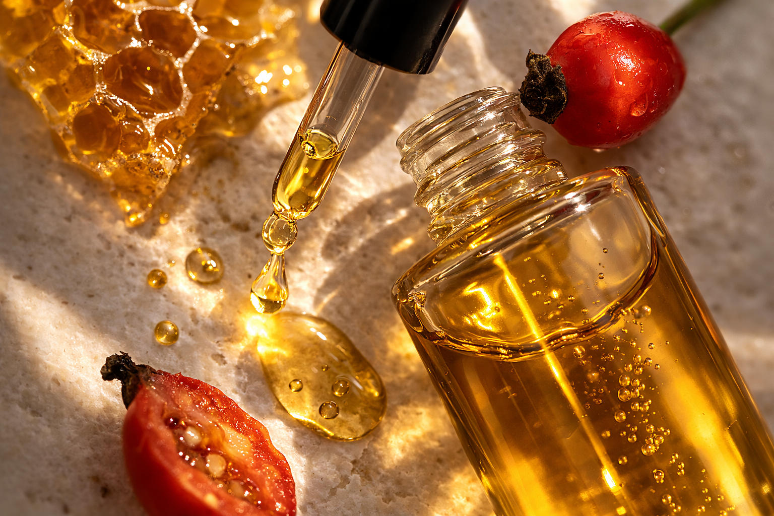
Ingredient Direction — Rosehip & Beeswax
Concept 01 · Ingredient Storytelling

Nothing is
Everything

A film and still campaign that turns absence into abundance. We shoot the botanical ingredients — not the final product — as the heroes. Rosehip against dark stone. Beeswax at golden hour. The formula, revealed at its source.

Strategic intent: Make “nothing added” feel like “everything necessary.” Shift the category conversation from what’s removed to what remains.

Visual Tone — Museum still life meets luxury skincare editorial. Rich, warm, unhurried.
Close-up portrait of luminous skin — editorial documentary beauty photography
Community Direction — Real Skin. Real People.
Concept 02 · Community Campaign

Sensitive Skin.
Bold Life.

Sensitive skin isn’t a limitation — it’s an identity. This campaign reframes it: joyful, grounded portraits of real people who stopped compromising. UGC elevated to editorial quality, treated with the same care as any campaign shoot.

Strategic intent: Own the “sensitive skin” consumer not through commiseration, but through confidence. Make the community the campaign.

Visual Tone — Intimate documentary portrait. Luminous honesty. Calm confidence, not perfection.
Clear glass vessels with concentrated skincare balm — scientific minimal editorial
Pledge Direction — Water vs Concentrate
Concept 03 · The Water(less) Pledge

1 Million Gallons
Saved

A living, visual campaign built around the pledge. Clear glass vessels. Water vs concentrate. The math made beautiful. Every product sold becomes part of a story the entire community owns — tracked, celebrated, and shared.

Strategic intent: Make environmental impact feel like collective achievement, not brand guilt. The pledge becomes the most compelling reason to buy.

Visual Tone — Scientific precision meets warm editorial. Instantly legible. Premium, not clinical.
The best skincare brands don’t ask you to want more.
They make you grateful for exactly what’s there
concentrated, alive, and grown from something real.
Maria Loren Ackies

What I bring

Leading creative across beauty, wellness, lifestyle, and national consumer brands — from boutique studio work to high-volume campaigns reaching millions each week.

Founder of Maria Loren Designs. Maria Loren has led creative direction and brand work for organizations and global brands including Northwell Health, Dole, Del Monte, Martha Stewart Living Omnimedia, Elizabeth Taylor Fragrances, Shark Beauty, Barbasol, Reventive, CopperFit, Snyder’s of Hanover, St. Jude Children’s Research Hospital, Broadway Cares, and The Actors Fund. Echo Awards Finalist.

Visual Identity Systems

Full-spectrum brand development from identity architecture to modular frameworks — built for scale, deployed across multiple business units and channels.

Campaign Direction

Directed 200+ weekly integrated campaigns — concept through post-production — across digital, email, social, print, and e-commerce for major national consumer brands.

Sustainability Storytelling

ESG and mission-driven creative — translating environmental values into visual language that feels celebratory, urgent, and human. Not cautionary.

Editorial Beauty Direction

Deep beauty and wellness editorial sensibility across DTC and lifestyle channels. Actively integrates AI tools for rapid concepting and production efficiency.

Photo & Video Art Direction

End-to-end production leadership — concepting, casting, styling, on-set direction, and post-production oversight for lifestyle, product, and portrait shoots.

Team Leadership & Operations

Built and led creative departments, mentored junior talent, and reduced production turnaround by 40% through workflow redesign and cross-team alignment.

Echo
Awards Finalist
Two direct mail campaigns
Direct marketing excellence
20%+
Sales Growth Driven
Performance-informed creative strategy
for major national consumer brand
$200K+
Capital Secured
Through strategic brand positioning
and narrative development
200+
Weekly Campaigns Led
High-volume integrated creative direction
at national DTC scale

First 30 Days

Not a slow ramp. A considered sprint — structured to make The Nothing Else’s creative foundation stronger before the end of month one.

Brand Clarity Audit
  • Audit existing visual identity across all touchpoints — web, social, packaging, retail
  • Identify gaps between brand intention and current visual expression
  • Review top-performing content to map what’s already working
  • Produce a short creative brief: “What The Nothing Else should feel like in 2026”
Visual Logic System
  • Build a refined ingredient visual language — macro photography direction, color palette, texture library
  • Define art direction principles for sensitive skin portraiture
  • Create a scalable typography and layout system for social, digital, and print
  • Establish how “waterless” looks, feels, and reads at a glance
Launch Assets
  • Deliver first round of on-brand social content using the new visual system
  • Produce a Water(less) Pledge visual campaign refresh
  • Develop a community UGC editorial framework and curation guide

Goal: Make the value of waterless skincare obvious — and irresistible — within seconds of seeing the brand.